 Film- Octodad Dadliest Catch
Bold medium size and colors use white and orange
we see the font in the middle of the screen and some font are moving about on the screen. behind the font we see characters appearing and we begin to hear some sort of music.
What do you like about this title sequence?
- Colours used
- Font used
- Information about the film
- The Music
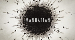
Film - Manhattan
Order of credits:
1. The Cast: Rachel Biosahan,Michael Chernus,Christopher Denhar,Alexia Fast&Katja Herbers
2. Created by: Sam Shaw
3.Ttile of the Film
What font type is used for titles
- small font is used in this film sequence& the colours used through out the film sequences title are black,grey and white. The font is on different sides of the screen and behind the font we see animation.
What do you like about this tile sequence?
- The small font used
- Animation used in the title sequence makes it look effective
- The dull colours used
No comments:
Post a Comment